No Fear
Supporting the relaunch of iconic 90s brand NO FEAR with a new data-driven homepage as part of Frasers Group...
🔖 Strategy, User Research, UX, UI
No FeaR
the project
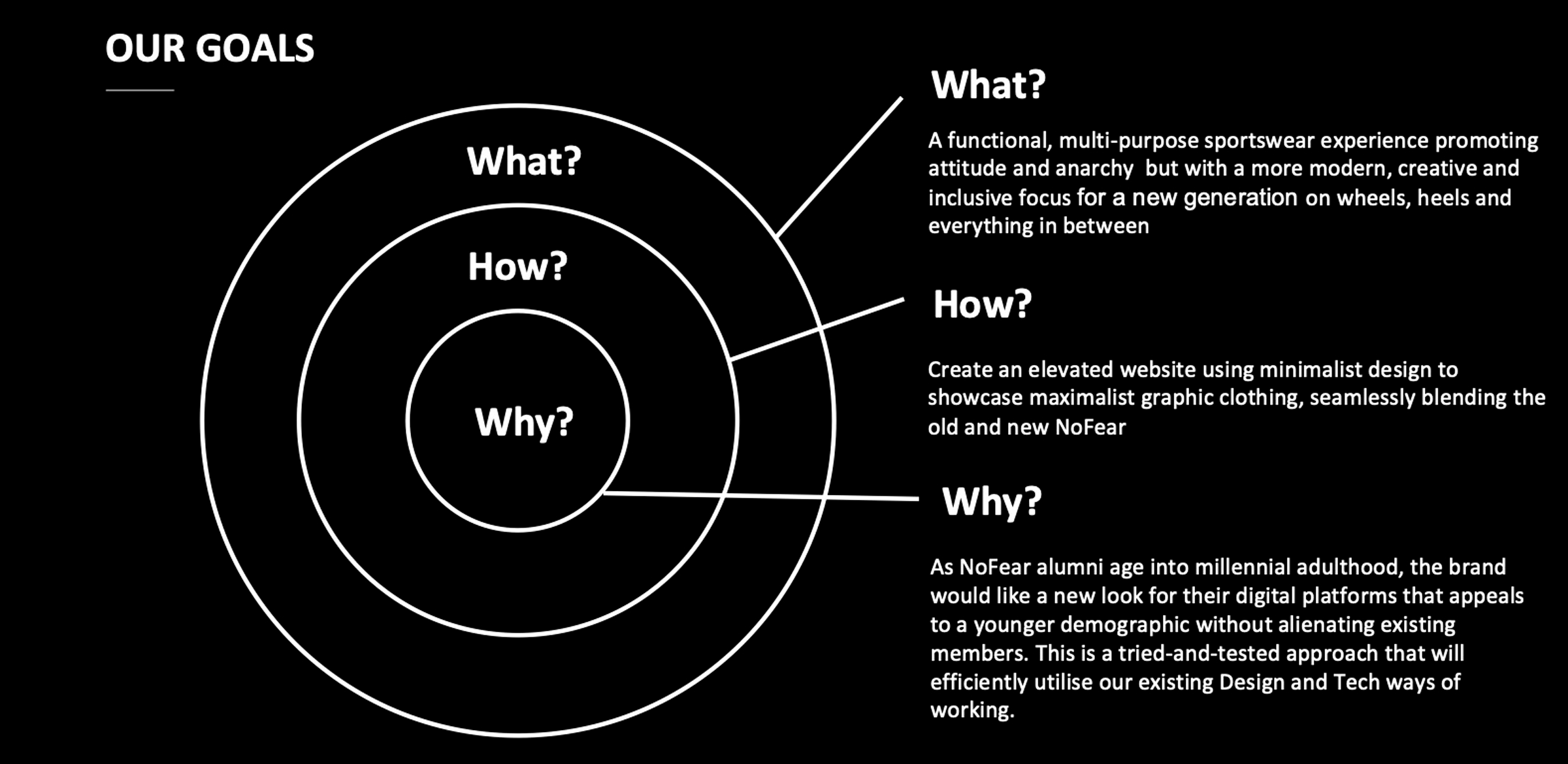
📄 Goal
Leading the Product Design workstream for the rebrand and relaunch of influential 90s lifestyle brand No Fear
🎯 OKRs
Validate and build better products with faster user insights
Create meaningful, accessible, and desirable products for users
📊 KPIs
Increase conversion rate from 0.1% to 1% YOY
Reduce bounce rates from 40% to 38% YOY
📝 Scope & Constraints
Redesign and re-platform the No Fear website between January and March 2024 with no budget for new features or continued optimisation
👤 Role & Responsibilities
Lead the project alongside a Junior Designer; carry out user research; design, prototype and develop the design system; test, refine and launch developer build
🛠️ Design Methods
Competitor analysis; site performance analysis; UX audit & benchmarking; unmoderated usability testing; design workshops; wireframing; prototyping; design system development
The Context
No Fear’s new Creative Director was keen to appeal to new customers currently in a similar age group to No Fear’s previous generation of customers when they first discovered the brand in the 1990s.
I took this as a unique opportunity for the brand’s multi-brand retail owner Frasers Group to tap directly into the hypebeast market through own-brand products, complementing the stockist relationship its other storefronts like Sports Direct have with the likes of Nike and adidas.
This meant balancing industry best practice with the anti-establishment rhetoric associated with Gen-Z and the brands they idolise for successfully crossing the threshold between brand and cultural catalyst in today’s over-saturated digital landscape.
The Discovery
With limited test-and-learn opportunities, it was crucial to establish a data-driven discovery process that benchmarked the existing site’s designs, conversions and performance against present-day competitors and contemporary best practice in user experience, interaction design and e-commerce among its target audience.
This included a usability study with a panel of users aged 25 and under to identify pain points, focusing primarily on Product Discovery, Search and early-stage Conversion. We also audited the existing website against competitors identified via search trends for achieving cult status selling their own line of products to a similar audience.
The Findings
-
100% of users regarded the existing site as "unfinished" with some assuming it was a prototype and other describing its information architecture as "poorly organised."
-
100% of users were confused about the range of products sold as well as the fact that the site sold products by brands other than No Fear
-
70% of users were disappointed to find categories with two or less products listed, sometimes even none with no redirects provided. Although supporting SEO efforts, the limited product range made the complex megamenu feel redundant.
-
90% of users agreed the site met general expectations for an e-commerce site with multiple product images, a conveniently-positioned CTA to add products to bag and a clear checkout process but the search and product discovery experience were limited by wrongly tagged products, broken breadcrumbs links and empty PLPs. A lack of product reviews also reduced customer trust in the minimal product descriptions.
The Delivery
These learnings formed the basis of our design ideation and development, working with developers as well as multiple stakeholder groups both within and external to the organisation to design and prototype the new UI. We also developed a design system alongside that seamlessly integrated with Frasers Group’s legacy tech stack to align with back-end changes to the site’s sales, fulfilment and customer service operations.
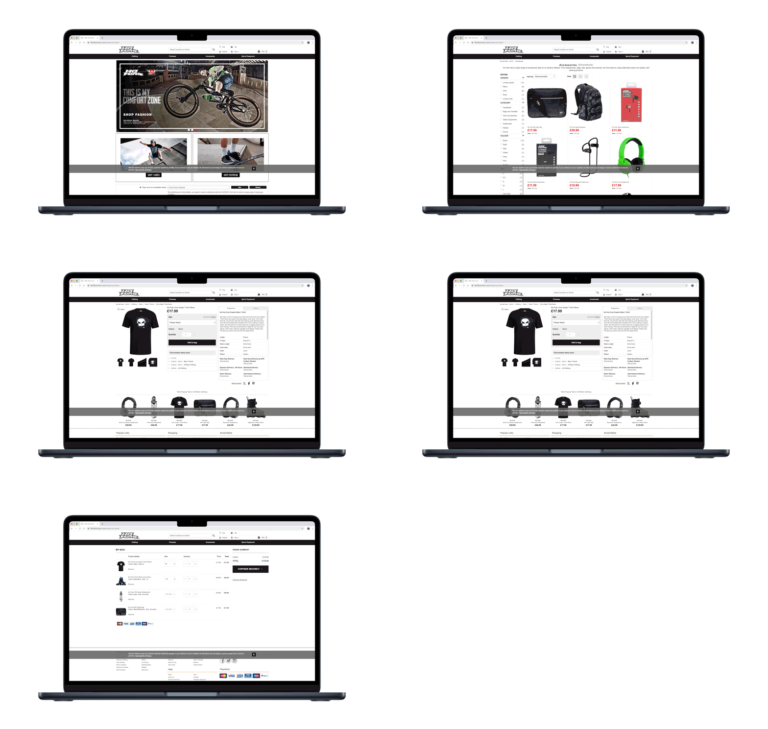
Before Users
After Users
The Results
Please note: flash warning for users with epilepsy
Although we won’t know if we’ve hit our YoY targets until March 2025, the new site is already trending positively across all KPIs.
And by laying a strong customer-led foundation for the project from the beginning, we were also able to contribute to the UX team’s primary objectives and key results regarding building accessible, inclusive products validated by users.
The Reflection
🏆 Highlights
One of the most refreshing aspects of this project was how influential user feedback proved to be.
In addition to informing designs, the analysis and design strategy also prompted a review of the Trading team’s initial decision to list stock from external brands on the site to help hit conversion targets.
This paved the way for a minimalist, focused brand site with a low SKU count presenting a drop-shipping opportunity.
🪚 Challenges
Besides production delays due to the Suez Canal crisis, one of the most challenging aspects was uniting the business around the creative decision not to have a homepage or megamenu, currently the only website in the Frasers Group ecosystem to do so.
Homepages are critical for enabling SEO, but with the low inventory and assets, a marketing-led acquisition strategy that dropped users directly on a single product listing page reduced content slots, rendered the navigation redundant for users whilst also shortening the conversion funnel for a faster checkout.
Check it out
🌐 Live Site | ⚙️ Prototype (soon come)


